
Works
About
Connect
Education Dashboard
Designing a clearer way for educators to see who needs attention, before it’s too late

“I have so many students. I need a tool that can help me see who needs my attention quickly and provides the specific data I need to help. ”

Educators often juggle lesson planning, grading, and student performance across disconnected tools. In that fragmentation, one thing gets lost: timely visibility into who is struggling.This project explores how an attention-based dashboard helps educators recognize patterns earlier and intervene with greater clarity.Early exploration revealed that while educators had access to data, they lacked a clear way to prioritize attention.
To comply with my non-disclosure agreement, some details have been omitted or generalized. All insights and design decisions presented are my own.

RoleUI/UX Designer
PlatformWeb Dashboard
Duration1.5 months
ScopeResearch
Information Architecture
Visual Design

Grounding the Product in Real Classroom Friction
Working alongside one other designer, I conducted 3 interviews with high school teachers and university professors to understand how they manage instructional workflows across a typical week. I later supported 2 usability tests to evaluate early design directions.
Across conversations, clear patterns emerged:
- Time was lost switching between platforms
- Data had to be manually pieced together
- Struggling students were often recognized too late
- Existing dashboards emphasized final grades over growth
Teachers weren’t lacking data.
They were lacking clarity.
This reframed the problem from information access to attention prioritization.

Sketching the Shape of the Dashboard
Before moving into Figma, I started by sketching out different dashboard cards and overall layout directions.This helped me translate research into something more tangible, exploring how key elements like at-risk indicators, trends, and cohort insights could take shape on the screen.
I also sketched full dashboard layouts to think through hierarchy and placement, making sure the most important information would surface quickly without overwhelming the view.
These sketches gave me a rough structure to work from and helped clarify how I wanted to frame my prompt when moving into Figma Make.
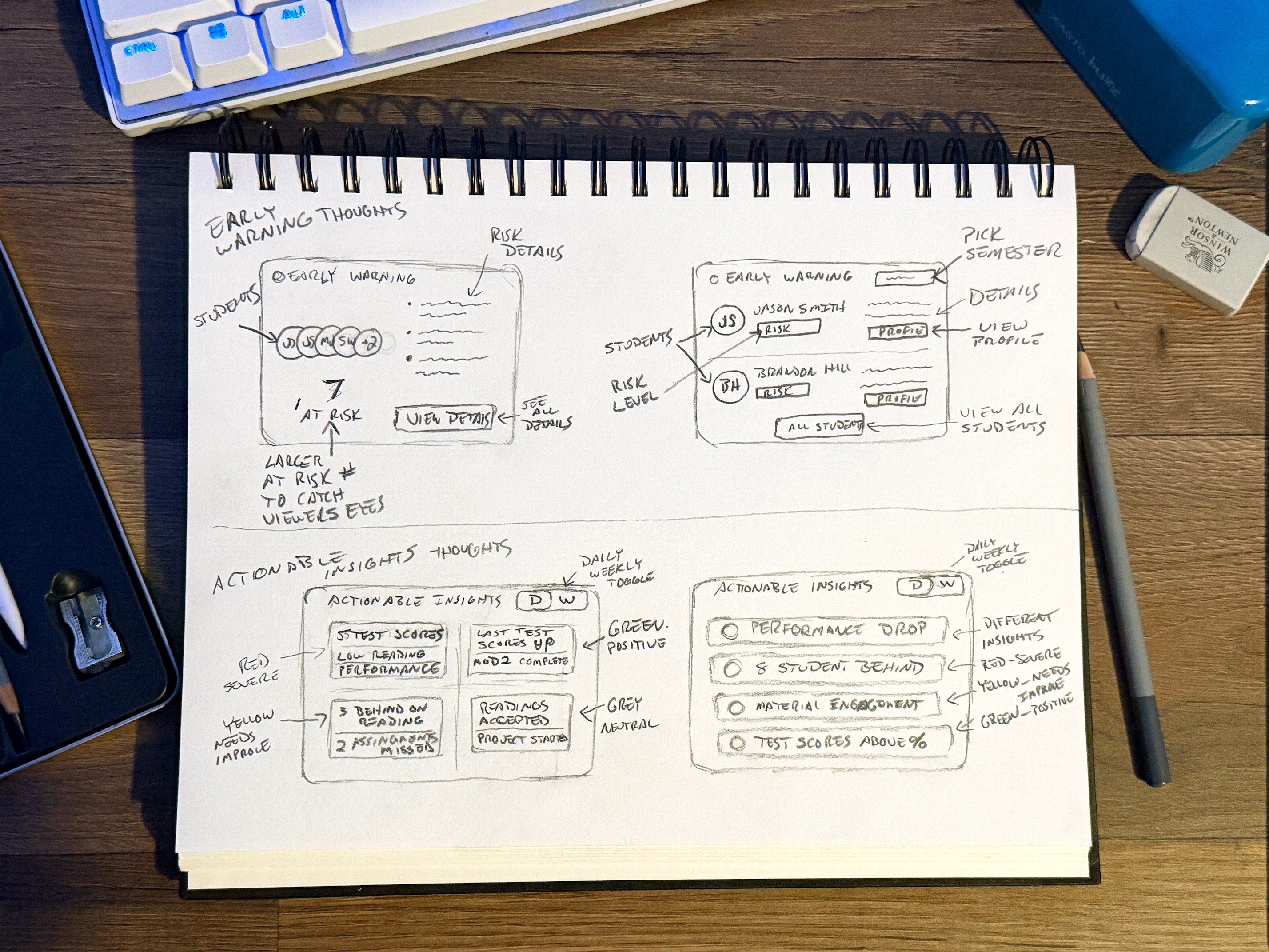
Early sketches exploring dashboard structure and card layout directions.

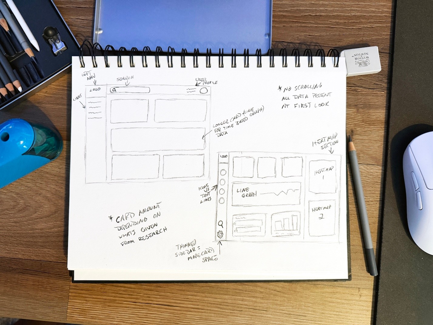
Using AI to Explore Layout Directions
With a rough structure already in place, I used Figma Make to quickly explore different layout directions.
This provided something concrete to react to, helping me test variations in hierarchy and spacing more efficiently.
Rather than using these outputs directly, I treated them as rough scaffolding; refining layout, interaction patterns, and visual hierarchy based on research and earlier sketches.
This approach helped speed up early exploration while keeping decisions grounded in the problem.
Using Figma Make to quickly explore layout directions based on earlier sketches.

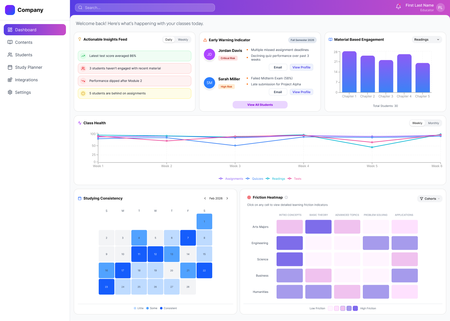
Structuring the Dashboard Around Attention and Hierarchy
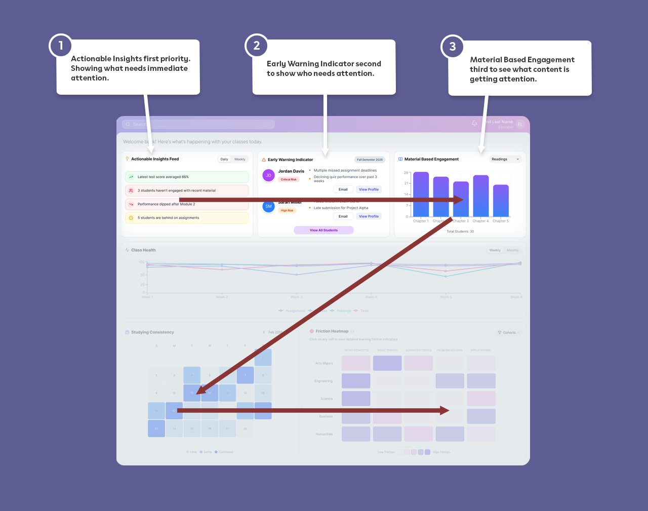
Research themes translated directly into layout decisions. If teachers needed faster recognition of at-risk students, those indicators couldn’t be buried.Rather than replacing educator judgment, the system was meant to support it. Early versions explored more data-dense layouts, but they felt overwhelming in practice, making it clear that better prioritization was needed.The dashboard prioritizes:
- Actionable Insights Feed
- Early Warning Indicators
- Material-Based EngagementThese elements are positioned for immediate visibility, following a natural left-to-right, top-to-bottom scan.The experience shifts from:Grade reporting → Attention prioritizationInstead of asking, “What were the scores?” The dashboard shows, “Who needs me right now?”

Designing Each Card as a Response to Research
Every card on the dashboard exists because of something educators shared. This kept the interface grounded in real classroom needs rather than abstract feature ideas.
- Early Warning Indicators show students at risk with visible reasoning and clear follow-up actions
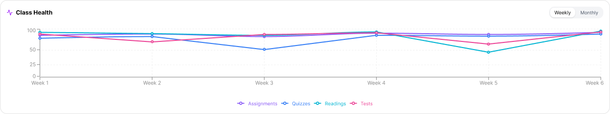
- Trend views highlight learning progression instead of static final grades
- Cohort heatmaps reveal where entire groups struggle with specific content
- Grouped sections reduce scanning effort
- Clear spacing and hierarchy support faster comprehension
Nothing was added for decoration.
Each element ties back to classroom friction.
Shared insights from educator interviews that led to dashboard card designs

Designing for Clearer, Faster, More Intentional Intervention
The dashboard was organized around one guiding question:What needs my attention right now?To support that:
- Signals are surfaced before deep analytics
- At-risk indicators appear before full performance breakdowns
- Cohort friction is visible without drilling into multiple views
- Cognitive load is reduced through structured groupingThe experience moves from monitoring to active instructional decision-making.Instead of reacting after grades close, educators can respond during the learning process.

What this Project Taught Me
- Visibility matters more than volume of data
- Hierarchy is a decision-making tool, not just a visual one
- Transparency builds trust faster than automation alone
- Research themes should shape layout, not just features
This project reinforced the importance of designing for attention, not just
information. By structuring the dashboard around intervention rather than
reporting, the experience supports earlier, more intentional classroom action.It also strengthened my ability to integrate emerging tools like AI into my workflow without losing intentionality in design decisions.


Content and design © 2026 Hemi Himmler

Works
About
Connect
Education Dashboard
Designing a clearer way for educators to see who needs attention, before it’s too late
“I have so many students. I need a tool that can help me see who needs my attention quickly and provides the specific data I need to help. ”

Educators often juggle lesson planning, grading, and student performance across disconnected tools. In that fragmentation, one thing gets lost: timely visibility into who is struggling.This project explores how an attention-based dashboard helps educators recognize patterns earlier and intervene with greater clarity.Early exploration revealed that while educators had access to data, they lacked a clear way to prioritize attention.
To comply with my non-disclosure agreement, some details have been omitted or generalized. All insights and design decisions presented are my own.

RoleUI/UX Designer
PlatformWeb Dashboard
Duration1.5 months
ScopeResearch
Information Architecture
Visual Design

Grounding the Product in Real Classroom Friction
Working alongside one other designer, I conducted 3 interviews with high school teachers and university professors to understand how they manage instructional workflows across a typical week. I later supported 2 usability tests to evaluate early design directions.
Across conversations, clear patterns emerged:
- Time was lost switching between platforms
- Data had to be manually pieced together
- Struggling students were often recognized too late
- Existing dashboards emphasized final grades over growth
Teachers weren’t lacking data.
They were lacking clarity.
This reframed the problem from information access to attention prioritization.

Sketching the Shape of the Dashboard
Before moving into Figma, I started by sketching out different dashboard cards and overall layout directions.This helped me translate research into something more tangible, exploring how key elements like at-risk indicators, trends, and cohort insights could take shape on the screen.
I also sketched full dashboard layouts to think through hierarchy and placement, making sure the most important information would surface quickly without overwhelming the view.
These sketches gave me a rough structure to work from and helped clarify how I wanted to frame my prompt when moving into Figma Make.
Early sketches exploring dashboard structure and card layout directions.

Using AI to Explore Layout Directions
With a rough structure already in place, I used Figma Make to quickly explore different layout directions.
This provided something concrete to react to, helping me test variations in hierarchy and spacing more efficiently.
Rather than using these outputs directly, I treated them as rough scaffolding; refining layout, interaction patterns, and visual hierarchy based on research and earlier sketches.
This approach helped speed up early exploration while keeping decisions grounded in the problem.
Using Figma Make to quickly explore layout directions based on earlier sketches.

Structuring the Dashboard Around Attention and Hierarchy
Research themes translated directly into layout decisions. If teachers needed faster recognition of at-risk students, those indicators couldn’t be buried.Rather than replacing educator judgment, the system was meant to support it. Early versions explored more data-dense layouts, but they felt overwhelming in practice, making it clear that better prioritization was needed.The dashboard prioritizes:
- Actionable Insights Feed
- Early Warning Indicators
- Material-Based EngagementThese elements are positioned for immediate visibility, following a natural left-to-right, top-to-bottom scan.The experience shifts from:Grade reporting → Attention prioritizationInstead of asking, “What were the scores?”The dashboard shows, “Who needs me right now?”

Designing Each Card as a Response to Research
Every card on the dashboard exists because of something educators shared. This kept the interface grounded in real classroom needs rather than abstract feature ideas.
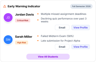
- Early Warning Indicators show students at risk with visible reasoning and clear follow-up actions
- Trend views highlight learning progression instead of static final grades
- Cohort heatmaps reveal where entire groups struggle with specific content
- Grouped sections reduce scanning effort
- Clear spacing and hierarchy support faster comprehension
Nothing was added for decoration.
Each element ties back to classroom friction.
Shared insights from educator interviews that led to dashboard card designs

Designing for Clearer, Faster, More Intentional Intervention
The dashboard was organized around one guiding question:What needs my attention right now?To support that:
- Signals are surfaced before deep analytics
- At-risk indicators appear before full performance breakdowns
- Cohort friction is visible without drilling into multiple views
- Cognitive load is reduced through structured groupingThe experience moves from monitoring to active instructional decision-making.Instead of reacting after grades close, educators can respond during the learning process.
What this Project Taught Me
- Visibility matters more than volume of data
- Hierarchy is a decision-making tool, not just a visual one
- Transparency builds trust faster than automation alone
- Research themes should shape layout, not just features
This project reinforced the importance of designing for attention, not just
information. By structuring the dashboard around intervention rather than
reporting, the experience supports earlier, more intentional classroom action.It also strengthened my ability to integrate emerging tools like AI into my workflow without losing intentionality in design decisions.
Content and design © 2026 Hemi Himmler
Works
About
Connect
Education Dashboard
Designing a clearer way for educators to see who needs attention, before it’s too late
“I have so many students. I need a tool that can help me see who needs my attention quickly and provides the specific data I need to help. ”

Educators often juggle lesson planning, grading, and student performance across disconnected tools. In that fragmentation, one thing gets lost: timely visibility into who is struggling.This project explores how an attention-based dashboard helps educators recognize patterns earlier and intervene with greater clarity.Early exploration revealed that while educators had access to data, they lacked a clear way to prioritize attention.
To comply with my non-disclosure agreement, some details have been omitted or generalized. All insights and design decisions presented are my own.

RoleUI/UX Designer
PlatformWeb Dashboard
Duration1.5 months
ScopeResearch
Information Architecture
Visual Design
Grounding the Product in Real Classroom Friction
Working alongside one other designer, I conducted 3 interviews with high school teachers and university professors to understand how they manage instructional workflows across a typical week. I later supported 2 usability tests to evaluate early design directions.
Across conversations, clear patterns emerged:
- Time was lost switching between platforms
- Data had to be manually pieced together
- Struggling students were often recognized too late
- Existing dashboards emphasized final grades over growth
Teachers weren’t lacking data.
They were lacking clarity.
This reframed the problem from information access to attention prioritization.

Sketching the Shape of the Dashboard
Before moving into Figma, I started by sketching out different dashboard cards and overall layout directions.This helped me translate research into something more tangible, exploring how key elements like at-risk indicators, trends, and cohort insights could take shape on the screen.
I also sketched full dashboard layouts to think through hierarchy and placement, making sure the most important information would surface quickly without overwhelming the view.
These sketches gave me a rough structure to work from and helped clarify how I wanted to frame my prompt when moving into Figma Make.
Early sketches exploring dashboard structure and card layout directions.
Using AI to Explore Layout Directions
With a rough structure already in place, I used Figma Make to quickly explore different layout directions.
This provided something concrete to react to, helping me test variations in hierarchy and spacing more efficiently.
Rather than using these outputs directly, I treated them as rough scaffolding; refining layout, interaction patterns, and visual hierarchy based on research and earlier sketches.
This approach helped speed up early exploration while keeping decisions grounded in the problem.
Using Figma Make to quickly explore layout directions based on earlier sketches.
Structuring the Dashboard Around Attention and Hierarchy
Research themes translated directly into layout decisions. If teachers needed faster recognition of at-risk students, those indicators couldn’t be buried.Rather than replacing educator judgment, the system was meant to support it. Early versions explored more data-dense layouts, but they felt overwhelming in practice, making it clear that better prioritization was needed.The dashboard prioritizes:
- Actionable Insights Feed
- Early Warning Indicators
- Material-Based EngagementThese elements are positioned for immediate visibility, following a natural left-to-right, top-to-bottom scan.The experience shifts from:Grade reporting → Attention prioritizationInstead of asking, “What were the scores?”The dashboard shows, “Who needs me right now?”
Designing Each Card as a Response to Research
Every card on the dashboard exists because of something educators shared. This kept the interface grounded in real classroom needs rather than abstract feature ideas.
- Early Warning Indicators show students at risk with visible reasoning and clear follow-up actions
- Trend views highlight learning progression instead of static final grades
- Cohort heatmaps reveal where entire groups struggle with specific content
- Grouped sections reduce scanning effort
- Clear spacing and hierarchy support faster comprehension
Nothing was added for decoration.
Each element ties back to classroom friction.
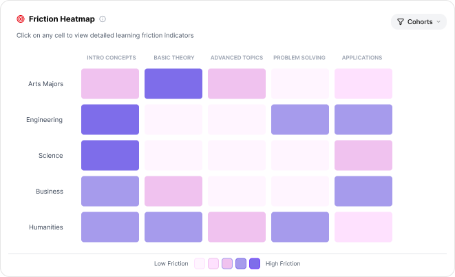
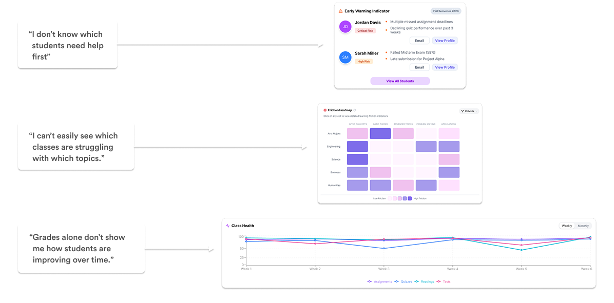
“I can’t easily see which classes are struggling with which topics.”
“Grades alone don’t show me how students are improving over time.”
“I don’t know which students need help first”


Early Warning Indicator
Friction Heatmap
Class Health
Shared insights from educator interviews that led to dashboard card designs
Designing for Clearer, Faster, More Intentional Intervention
The dashboard was organized around one guiding question:What needs my attention right now?To support that:
- Signals are surfaced before deep analytics
- At-risk indicators appear before full performance breakdowns
- Cohort friction is visible without drilling into multiple views
- Cognitive load is reduced through structured groupingThe experience moves from monitoring to active instructional decision-making.Instead of reacting after grades close, educators can respond during the learning process.
What this Project Taught Me
- Visibility matters more than volume of data
- Hierarchy is a decision-making tool, not just a visual one
- Transparency builds trust faster than automation alone
- Research themes should shape layout, not just features
This project reinforced the importance of designing for attention, not just
information. By structuring the dashboard around intervention rather than
reporting, the experience supports earlier, more intentional classroom action.It also strengthened my ability to integrate emerging tools like AI into my workflow without losing intentionality in design decisions.
Content and design © 2026 Hemi Himmler