
Works
About
Connect
Spotify
Pause Personalized Playlists
Designing for playlist control within Spotify’s fast-moving ecosystem

“A lot is thrown at me when I open the app and I don’t feel like I can control the pace of things. Just chill and let me try to enjoy this first.”

Spotify continuously refreshes personalized playlists based on listening behavior. While this fuels discovery, it can also create pressure; playlists change quickly and users feel rushed to save songs before they disappear.
This case study documents how I identified that tension, researched user emotional responses to personalization speed, and designed a feature that allows listeners to slow down playlist updates and pause recommendation learning when desired.

RoleUI/UX Designer
PlatformMobile (Concept Feature)
Duration3 weeks
ScopeResearch
Interaction Design
Prototyping
Prototype


Identifying an Opportunity for More Playlist Control
This project began with a shared frustration.
I would discover a personalized playlist I enjoyed, return later, and find it replaced, sometimes within minutes. Instead of enjoying music, I felt like I needed to “catch” songs before they vanished.
What started as a small annoyance began to feel like a pattern. Instead of enjoying the playlist, I found myself rushing to save songs before they disappeared.
Conversations with other users revealed similar behaviors:
・Feeling rushed to save songs・Never fully exploring generated playlists・Being overwhelmed by the amount of recommendations
There was also a privacy layer beneath the frustration. Sometimes users want to listen to a “guilty pleasure” artist, without permanently shaping their algorithm.These patterns revealed an opportunity:Users didn’t want fewer recommendations. They wanted more control.


A Pace to Enjoy and Discover Music
To better understand the issue, I conducted a competitive analysis comparing Spotify with Apple Music, YouTube Music, and Amazon Music.
I tracked how frequently home screens refreshed and how long personalized sections remained stable.
Key observation:
・Spotify refreshed recommendations significantly faster than competitors
Other platforms allowed users more time with recommendations before reshuffling them. This discovery highlighted a design opportunity to create a slower, more deliberate experience.
App Store reviews reinforced this insight. Users expressed a desire to move at their own pace rather than constantly keeping up with shifting playlists.
The issue wasn’t content volume, it was timing.Below shows an example of this. After having the app open for awhile, when I went back to choose a different playlist, four seconds later, everything shifted.
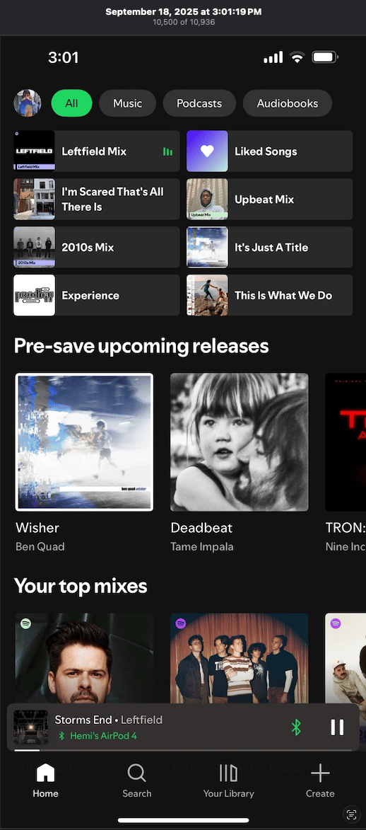
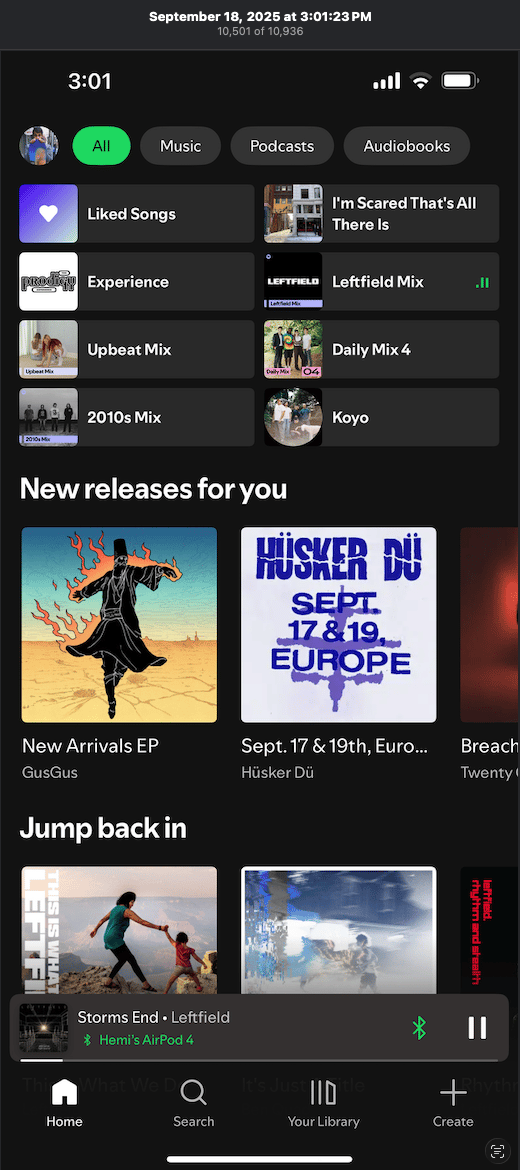

This playlist structure literally changed AFTER FOUR SECONDS!- My Upbeat Mix completely changed
- Pre-save releases turned into New releases
- My Top mixes gone
So many changes in a short periodof time.

Static Playlists, Guilty Pleasures - What I Learned from Research
After competitive testing, I conducted user interviews to understand the emotional side of personalization.
Participants shared experiences that clarified the deeper problem.
One compared their home screen to their dog: “I just wish I could tell it to stay.” Another described needing to play children’s music while babysitting, but not wanting it to influence personal recommendations. Others admitted avoiding certain genres to prevent algorithm changes.
While each participant described the problem differently, their stories pointed to the same underlying tension.
・Desire for stability・Desire for privacy and ownership
The frustration wasn’t just about playlists refreshing, it was about feeling that every listening choice had consequences.
To organize these findings, I created an affinity map that grouped responses around control, privacy, and intentional listening. These themes became the foundation of the feature direction.

Interface vs Settings
My initial instinct was to place a pause button directly on the home screen. However, this conflicted with existing playback controls and risked confusion.
I explored several placement options:Each option revealed tradeoffs between visibility, clarity, and consistency with Spotify’s existing controls.・Home screen integration・Profile-level control・Contextual banner・Settings-based toggle
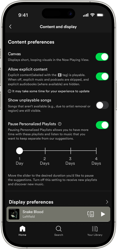
Because personalization functions at a system level, placing the feature within Settings aligned best with Spotify’s existing patterns and user expectations.
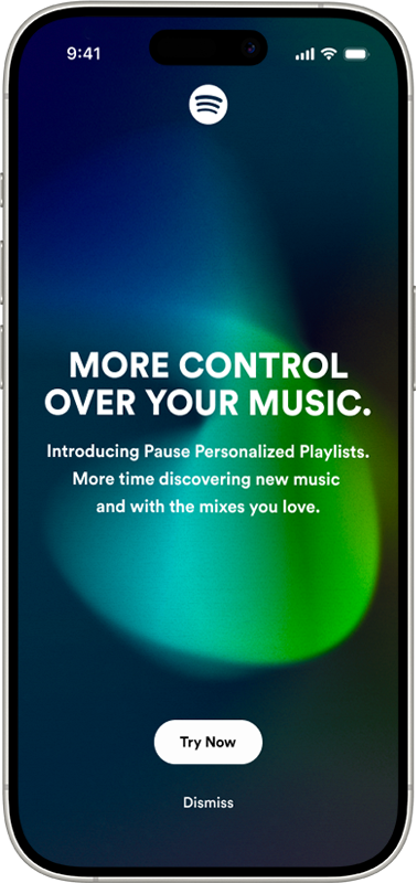
From there, I explored different interaction styles including toggles, sliders, and radial controls. The solution became a clear toggle labeled:
Pause Personalized Playlists
This language distinguished it from pausing music playback and communicated the feature’s purpose directly.
The goal wasn’t to disrupt discovery, but to introduce flexibility within it.
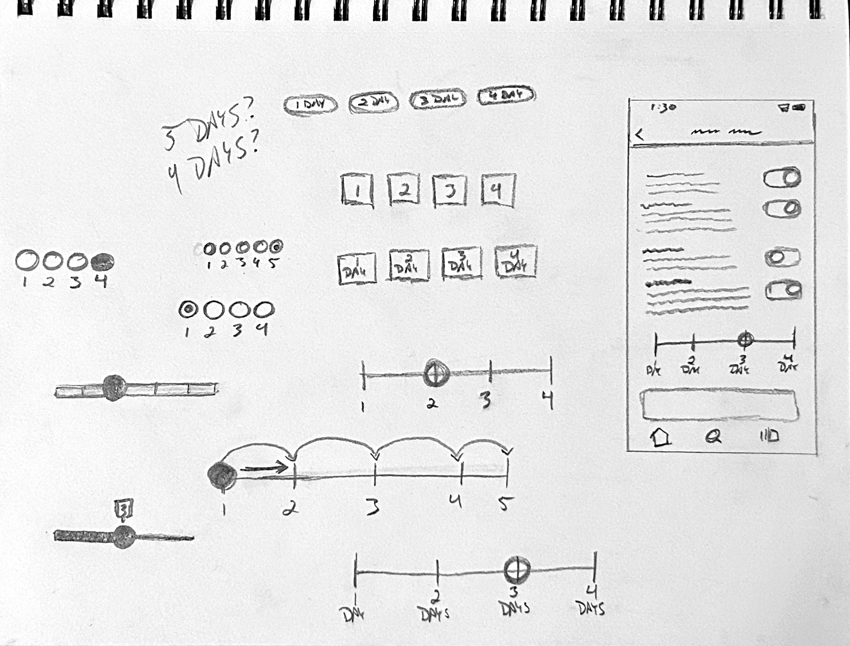
Button and Slider exploration sketches for the setting

Validating the Concept Through User Feedback
User testing focused on clarity and interpretation.
Participants were asked:
・What do you think this feature does?・When would you use it?・Does this feel helpful or unnecessary?
Early terminology such as “Freeze Algorithm” created confusion. Renaming it to “Pause Personalized Playlists” improved comprehension and felt more aligned with Spotify’s voice.
Users also wanted reassurance that the pause was temporary and reversible. Adding explanatory microcopy and confirmation feedback reduced uncertainty.
Many described the feature as relieving, a subtle but meaningful emotional response that validated the concept.

Designing for Simplicity, Connection, and Control
From initial sketches to final prototype, simplicity guided the design.
The feature allows users to:
・Pause personalized playlist updates・Temporarily stop recommendation learning・Resume personalization at any time
It integrates into Spotify’s interface without adding clutter or disrupting discovery.
Pause Personalized Playlists provides users with a moment of control in a fast-moving platform. Rather than reducing personalization, it introduces balance which allows listeners to slow down when they choose.
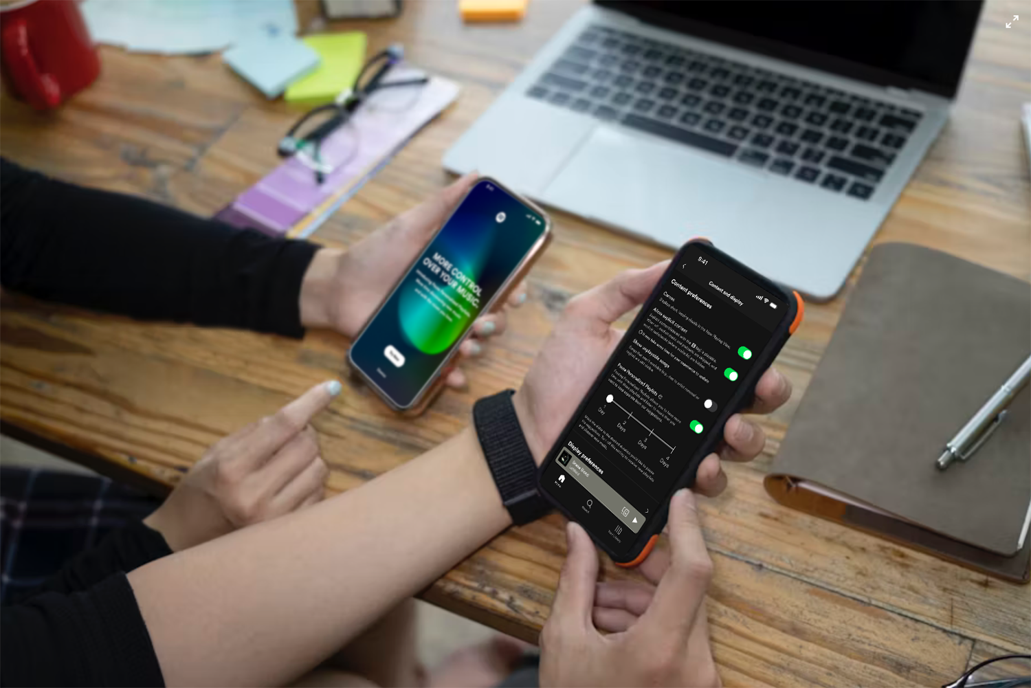
See the feature in motion. One toggle, paused personalization, and a quieter home screen. More time to enjoy.

What this Project Taught Me
This project changed how I think about personalization systems.
・High-performing systems can still create subtle emotional friction・Speed and control must be intentionally balanced・Privacy concerns often surface through behavior, not complaints・Small system-level features can create meaningful user relief
This project reinforced the value of designing for ownership. In a platform built on constant movement, creating space to pause can strengthen trust rather than weaken engagement.
Next


Content and design © 2026 Hemi Himmler

Works
About
Connect
Spotify
Pause Personalized Playlists
Designing for playlist control within Spotify’s fast-moving ecosystem
“A lot is thrown at me when I open the app and I don’t feel like I can control the pace of things. Just chill and let me try to enjoy this first.”

Spotify continuously refreshes personalized playlists based on listening behavior. While this fuels discovery, it can also create pressure; playlists change quickly and users feel rushed to save songs before they disappear.
This case study documents how I identified that tension, researched user emotional responses to personalization speed, and designed a feature that allows listeners to slow down playlist updates and pause recommendation learning when desired.

RoleUI/UX Designer
PlatformMobile (Concept Feature)
Duration3 weeks
ScopeResearch
Interaction Design
Prototyping
Prototype

Identifying an Opportunity for More Playlist Control
This project began with a shared frustration.
I would discover a personalized playlist I enjoyed, return later, and find it replaced, sometimes within minutes. Instead of enjoying music, I felt like I needed to “catch” songs before they vanished.
What started as a small annoyance began to feel like a pattern. Instead of enjoying the playlist, I found myself rushing to save songs before they disappeared.
Conversations with other users revealed similar behaviors:
・Feeling rushed to save songs・Never fully exploring generated playlists・Being overwhelmed by the amount of recommendations
There was also a privacy layer beneath the frustration. Sometimes users want to listen to a “guilty pleasure” artist, without permanently shaping their algorithm.These patterns revealed an opportunity:Users didn’t want fewer recommendations. They wanted more control.

A Pace to Enjoy and Discover Music
To better understand the issue, I conducted a competitive analysis comparing Spotify with Apple Music, YouTube Music, and Amazon Music.
I tracked how frequently home screens refreshed and how long personalized sections remained stable.
Key observation:
・Spotify refreshed recommendations significantly faster than competitors
Other platforms allowed users more time with recommendations before reshuffling them. This discovery highlighted a design opportunity to create a slower, more deliberate experience.
App Store reviews reinforced this insight. Users expressed a desire to move at their own pace rather than constantly keeping up with shifting playlists.
The issue wasn’t content volume, it was timing.Below shows an example of this. After having the app open for awhile, when I went back to choose a different playlist, four seconds later, everything shifted.

This playlist structure literally changed
AFTER FOUR SECONDS!- My Upbeat Mix completely changed
- Pre-save releases turned into New releases
- My Top mixes gone
So many changes in a short period of time.

Static Playlists, Guilty Pleasures - What I Learned from Research
After competitive testing, I conducted user interviews to understand the emotional side of personalization.
Participants shared experiences that clarified the deeper problem.
One compared their home screen to their dog: “I just wish I could tell it to stay.” Another described needing to play children’s music while babysitting, but not wanting it to influence personal recommendations. Others admitted avoiding certain genres to prevent algorithm changes.
While each participant described the problem differently, their stories pointed to the same underlying tension.
・Desire for stability・Desire for privacy and ownership
The frustration wasn’t just about playlists refreshing, it was about feeling that every listening choice had consequences.
To organize these findings, I created an affinity map that grouped responses around control, privacy, and intentional listening. These themes became the foundation of the feature direction.

Interface vs Settings
My initial instinct was to place a pause button directly on the home screen. However, this conflicted with existing playback controls and risked confusion.
I explored several placement options:Each option revealed tradeoffs between visibility, clarity, and consistency with Spotify’s existing controls.・Home screen integration・Profile-level control・Contextual banner・Settings-based toggle
Because personalization functions at a system level, placing the feature within Settings aligned best with Spotify’s existing patterns and user expectations.
From there, I explored different interaction styles including toggles, sliders, and radial controls. The solution became a clear toggle labeled:
Pause Personalized Playlists
This language distinguished it from pausing music playback and communicated the feature’s purpose directly.
The goal wasn’t to disrupt discovery, but to introduce flexibility within it.
Button and Slider exploration sketches for the setting

Validating the Concept Through User Feedback
User testing focused on clarity and interpretation.
Participants were asked:
・What do you think this feature does?・When would you use it?・Does this feel helpful or unnecessary?
Early terminology such as “Freeze Algorithm” created confusion. Renaming it to “Pause Personalized Playlists” improved comprehension and felt more aligned with Spotify’s voice.
Users also wanted reassurance that the pause was temporary and reversible. Adding explanatory microcopy and confirmation feedback reduced uncertainty.
Many described the feature as relieving, a subtle but meaningful emotional response that validated the concept.
Designing for Simplicity, Connection, and Control
From initial sketches to final prototype, simplicity guided the design.
The feature allows users to:
・Pause personalized playlist updates・Temporarily stop recommendation learning・Resume personalization at any time
It integrates into Spotify’s interface without adding clutter or disrupting discovery.
Pause Personalized Playlists provides users with a moment of control in a fast-moving platform. Rather than reducing personalization, it introduces balance which allows listeners to slow down when they choose.
See the feature in motion. One toggle, paused personalization, and a quieter home screen. More time to enjoy.
What this Project Taught Me
This project changed how I think about personalization systems.
・High-performing systems can still create subtle emotional friction・Speed and control must be intentionally balanced・Privacy concerns often surface through behavior, not complaints・Small system-level features can create meaningful user relief
This project reinforced the value of designing for ownership. In a platform built on constant movement, creating space to pause can strengthen trust rather than weaken engagement.
Next
Content and design © 2026 Hemi Himmler
Works
About
Connect
Spotify
Pause Personalized Playlists
Designing for playlist control within Spotify’s fast-moving ecosystem
“A lot is thrown at me when I open the app and I don’t feel like I can control the pace of things. Just chill and let me try to enjoy this first.”

Spotify continuously refreshes personalized playlists based on listening behavior. While this fuels discovery, it can also create pressure; playlists change quickly and users feel rushed to save songs before they disappear.
This case study documents how I identified that tension, researched user emotional responses to personalization speed, and designed a feature that allows listeners to slow down playlist updates and pause recommendation learning when desired.

Identifying an Opportunity for More Playlist Control
This project began with a shared frustration.
I would discover a personalized playlist I enjoyed, return later, and find it replaced, sometimes within minutes. Instead of enjoying music, I felt like I needed to “catch” songs before they vanished.
What started as a small annoyance began to feel like a pattern. Instead of enjoying the playlist, I found myself rushing to save songs before they disappeared.
Conversations with other users revealed similar behaviors:
・Feeling rushed to save songs・Never fully exploring generated playlists・Being overwhelmed by the amount of recommendations
There was also a privacy layer beneath the frustration. Sometimes users want to listen to a “guilty pleasure” artist, without permanently shaping their algorithm.These patterns revealed an opportunity:Users didn’t want fewer recommendations. They wanted more control.
A Pace to Enjoy and Discover Music
To better understand the issue, I conducted a competitive analysis comparing Spotify with Apple Music, YouTube Music, and Amazon Music.
I tracked how frequently home screens refreshed and how long personalized sections remained stable.
Key observation:
・Spotify refreshed recommendations significantly faster than competitors
Other platforms allowed users more time with recommendations before reshuffling them. This discovery highlighted a design opportunity to create a slower, more deliberate experience.
App Store reviews reinforced this insight. Users expressed a desire to move at their own pace rather than constantly keeping up with shifting playlists.
The issue wasn’t content volume, it was timing.Below shows an example of this. After having the app open for awhile, when I went back to choose a different playlist, four seconds later, everything shifted.

This playlist structure literally changed
AFTER FOUR SECONDS!- My Upbeat Mix completely changed
- Pre-save releases turned into New releases
- My Top mixes gone
So many changes in a short period of time.
Static Playlists, Guilty Pleasures - What I Learned from Research
After competitive testing, I conducted user interviews to understand the emotional side of personalization.
Participants shared experiences that clarified the deeper problem.
One compared their home screen to their dog: “I just wish I could tell it to stay.” Another described needing to play children’s music while babysitting, but not wanting it to influence personal recommendations. Others admitted avoiding certain genres to prevent algorithm changes.
While each participant described the problem differently, their stories pointed to the same underlying tension.
・Desire for stability・Desire for privacy and ownership
The frustration wasn’t just about playlists refreshing, it was about feeling that every listening choice had consequences.
To organize these findings, I created an affinity map that grouped responses around control, privacy, and intentional listening. These themes became the foundation of the feature direction.
Interface vs Settings
My initial instinct was to place a pause button directly on the home screen. However, this conflicted with existing playback controls and risked confusion.
I explored several placement options:Each option revealed tradeoffs between visibility, clarity, and consistency with Spotify’s existing controls.
・Home screen integration・Profile-level control・Contextual banner・Settings-based toggle
Because personalization functions at a system level, placing the feature within Settings aligned best with Spotify’s existing patterns and user expectations.
From there, I explored different interaction styles including toggles, sliders, and radial controls. The solution became a clear toggle labeled:
Pause Personalized Playlists
This language distinguished it from pausing music playback and communicated the feature’s purpose directly.
The goal wasn’t to disrupt discovery, but to introduce flexibility within it.
Button and Slider exploration sketches for the setting
Validating the Concept Through User Feedback
User testing focused on clarity and interpretation.
Participants were asked:
・What do you think this feature does?・When would you use it?・Does this feel helpful or unnecessary?
Early terminology such as “Freeze Algorithm” created confusion. Renaming it to “Pause Personalized Playlists” improved comprehension and felt more aligned with Spotify’s voice.
Users also wanted reassurance that the pause was temporary and reversible. Adding explanatory microcopy and confirmation feedback reduced uncertainty.
Many described the feature as relieving, a subtle but meaningful emotional response that validated the concept.
Designing for Simplicity, Connection, and Control
From initial sketches to final prototype, simplicity guided the design.
The feature allows users to:
・Pause personalized playlist updates・Temporarily stop recommendation learning・Resume personalization at any time
It integrates into Spotify’s interface without adding clutter or disrupting discovery.
Pause Personalized Playlists provides users with a moment of control in a fast-moving platform. Rather than reducing personalization, it introduces balance which allows listeners to slow down when they choose.
See the feature in motion. One toggle, paused personalization, and a quieter home screen. More time to enjoy.
What this Project Taught Me
This project changed how I think about personalization systems.
・High-performing systems can still create subtle emotional friction・Speed and control must be intentionally balanced・Privacy concerns often surface through behavior, not complaints・Small system-level features can create meaningful user relief
This project reinforced the value of designing for ownership. In a platform built on constant movement, creating space to pause can strengthen trust rather than weaken engagement.
Next
Content and design © 2026 Hemi Himmler