
Works
About
Connect
Patient portals are only available once you are with an established health care system. If you’re not a part of one or your system doesn’t offer a patient portal, organizing your health care needs can be an overwhelming manual process.
Mobile site prototype available here
Solution
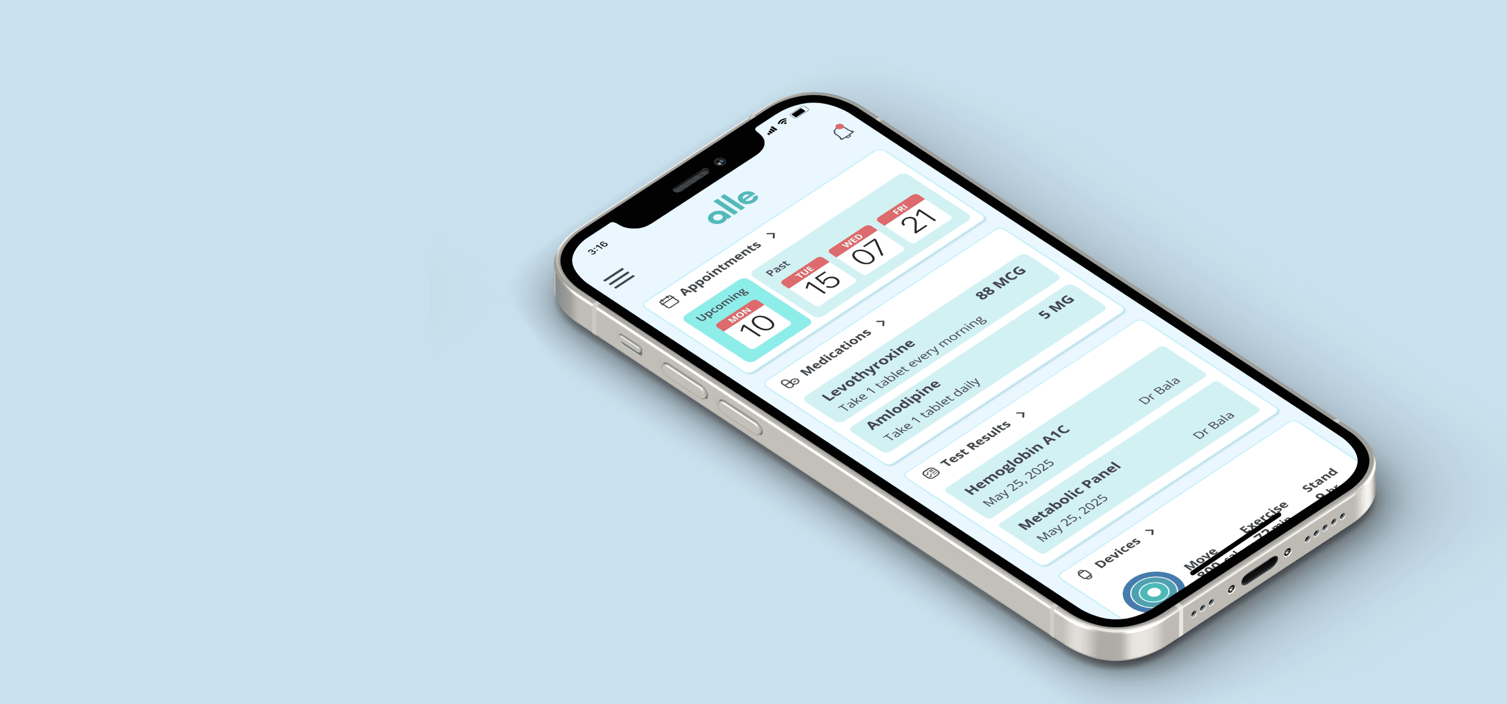
Design a patient portal that does not have health care requirements and is accessible to anyone in need. Give access to tools that help make appointments, keep track of medications, connect with your doctors, and reduce the stress from health care tasks.
My Role
I spent one month as the sole designer completing all the steps of this project. I conducted the research, synthesized the findings, and designed and built a mobile-first patient portal. Once finished, I conducted user tests of the product, and then finalized it for use.
Starting my research
Research Goals
I want to learn how people organize their healthcare needs without access to resources so that I can discover what features would help them with an accessible online tool.
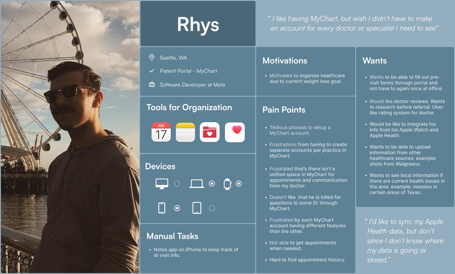
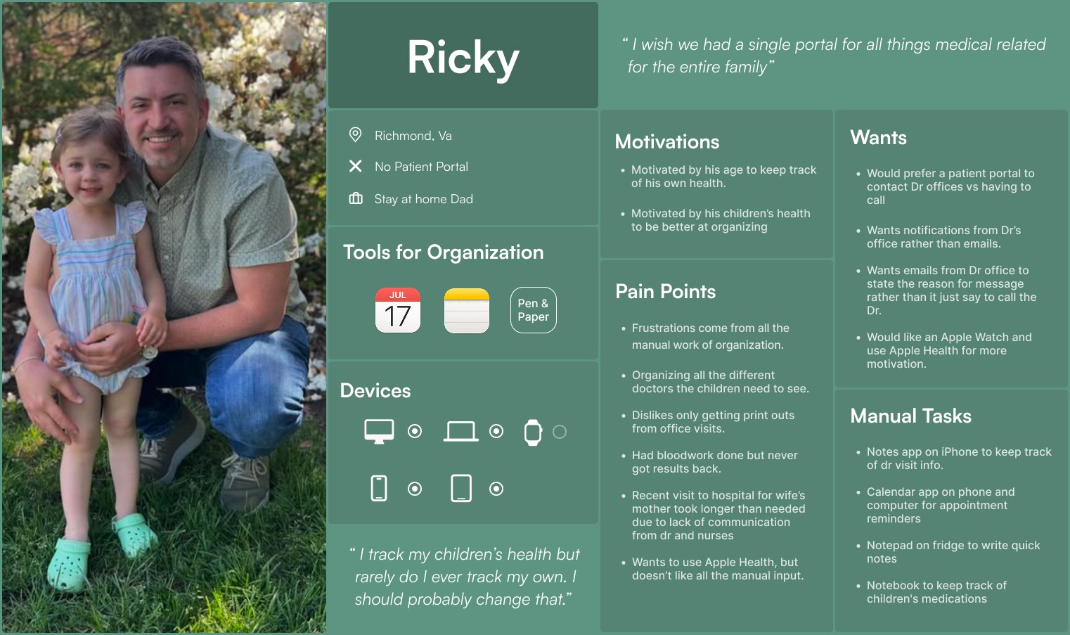
I conducted four remote user interviews to discover how people organize their health, with or without the use of a patient portal. I was also able to dive deeper into what people wanted or liked about patient portals and what could truly help them.
These interviews revealed that ease of use, messaging their doctors, working with health devices, and scheduling were top needs.

Having better device integration with Apple Health to my patient portal would be great.
I wouldn’t have to wait till next visit to show the doctor. - Cory

I don’t currently track anything. I use to but had to do it all manually which got old. - Rob
Participant Stories
I gained a lot of insight from the interviews that allowed me to assemble details into user personas. These became the target audience base for users with and without a patient portal.
Ideation
Storyboarding
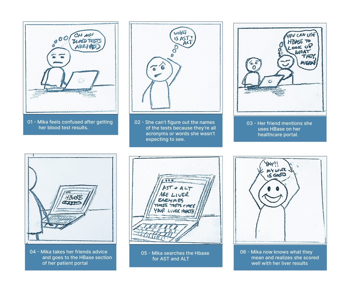
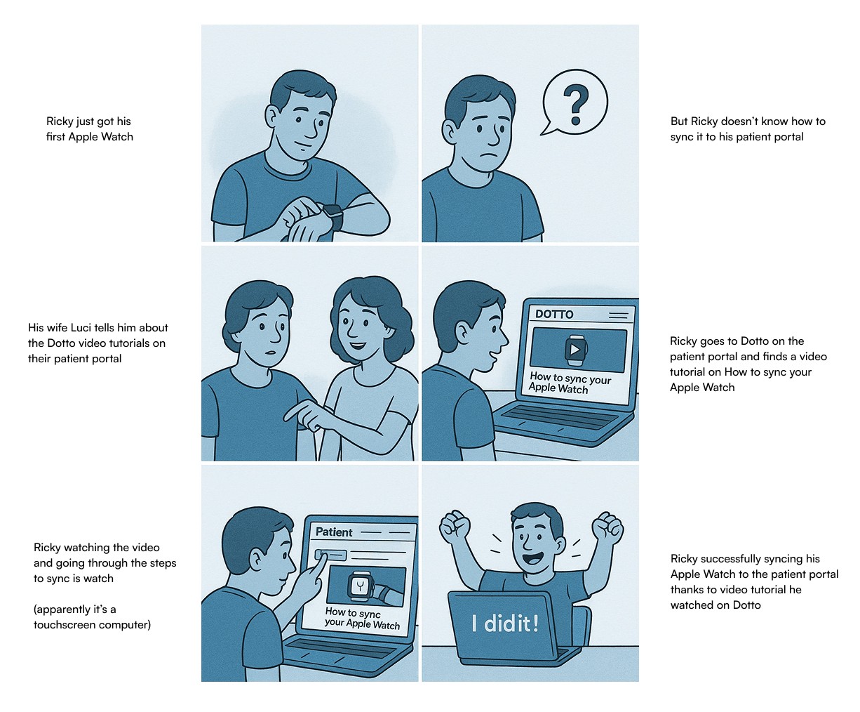
What real life situations might someone face when using a patient portal? What did my participants mention or what have I ran into with my own experiences?
Two challenges I discovered through interviews and other discussions were not knowing medical terminology and how to use a patient portal. These were the bases for my storyboards.
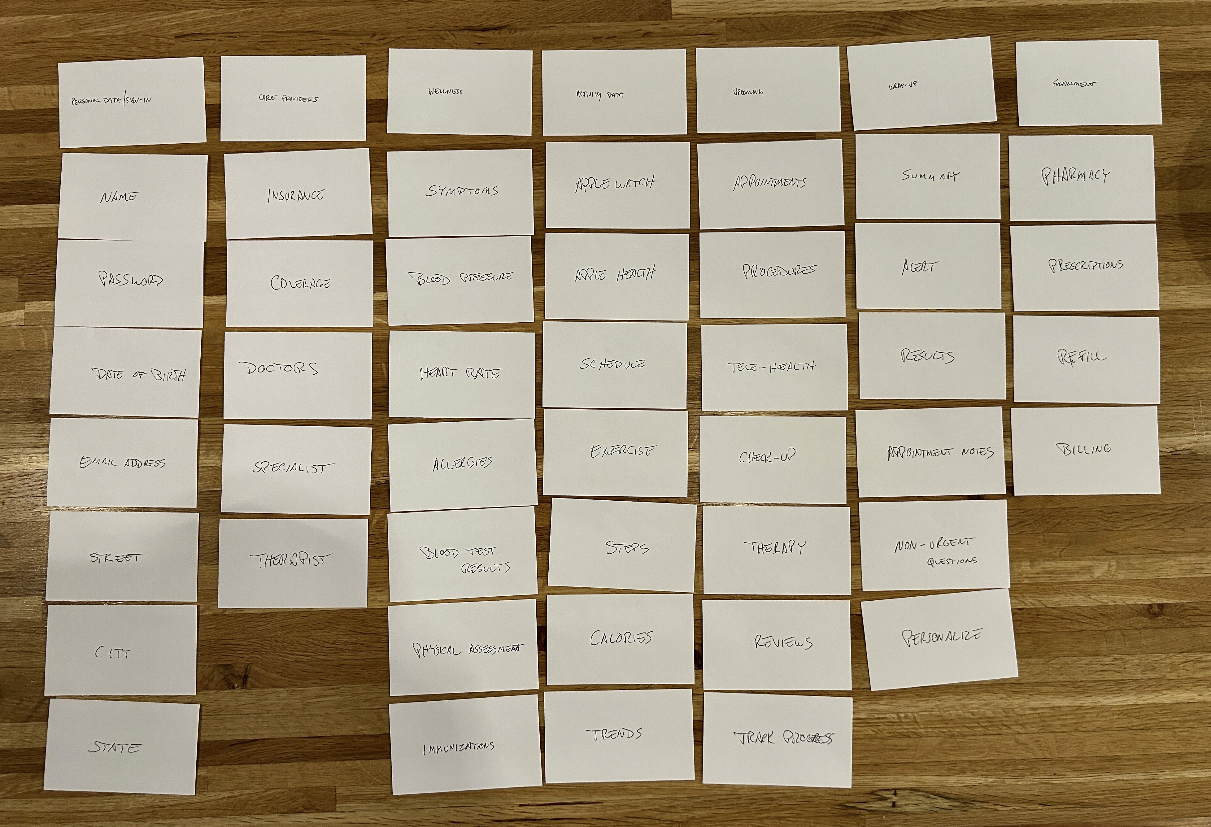
Prioritizing
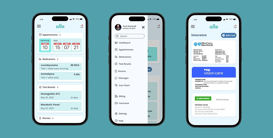
After storyboarding and gathering ideas for features, what items became important for the users? I enlisted their help to do card sorts to find out. Each card had a topic related to a patient portal which they would use to build a structure for the site. What order made sense to them when navigating? This solidified the structural idea I had for the site - a dashboard.
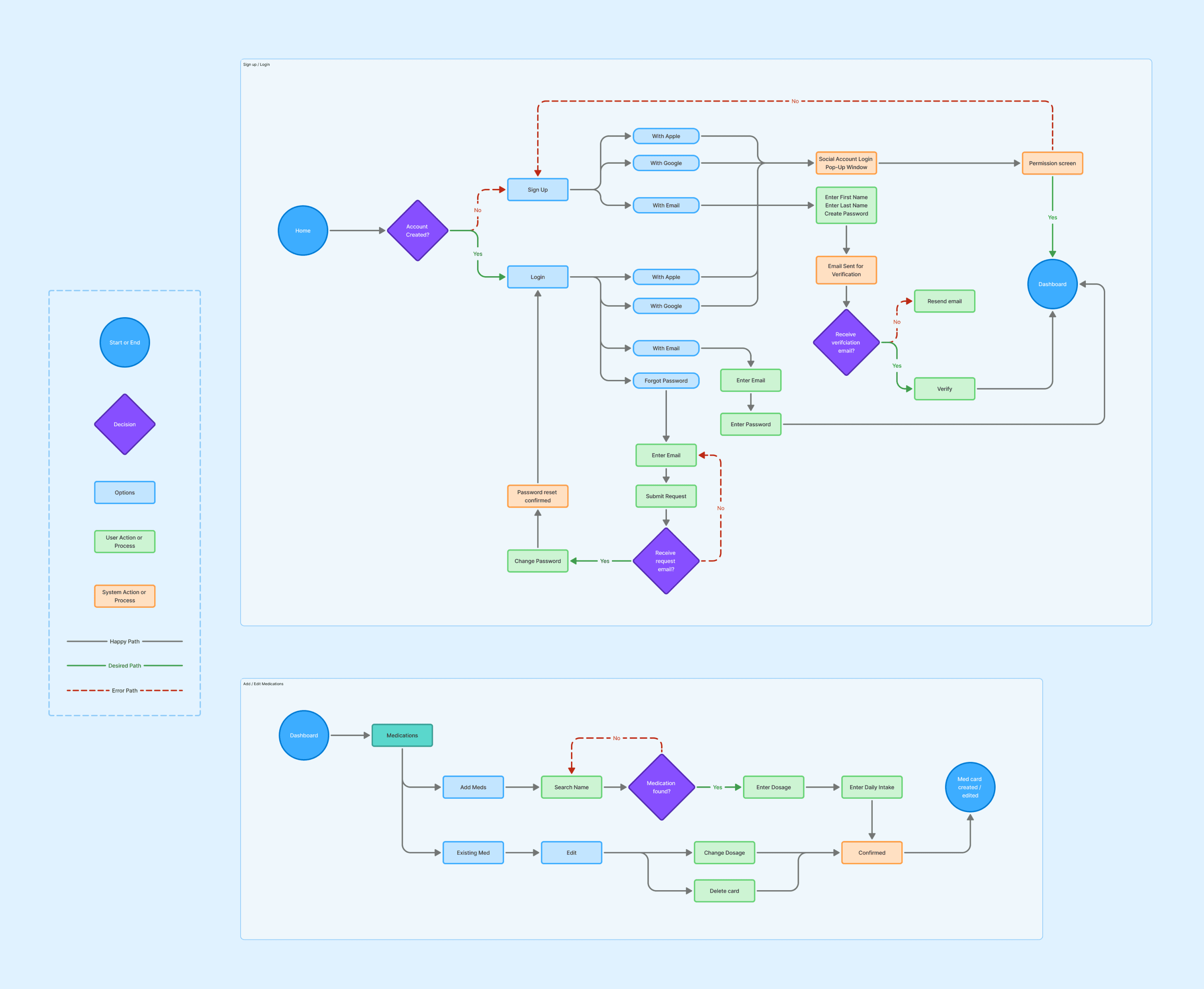
A Path
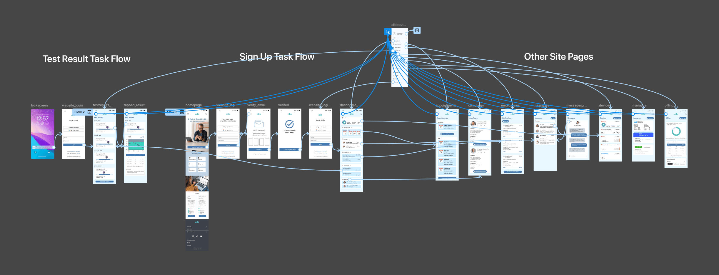
The next step was to determine some user flows. The sign up step is important and I felt it should be dialed in quickly, that became my first user flow. The second user flow was more specified with adding or editing a medication.
Design
Wireframing
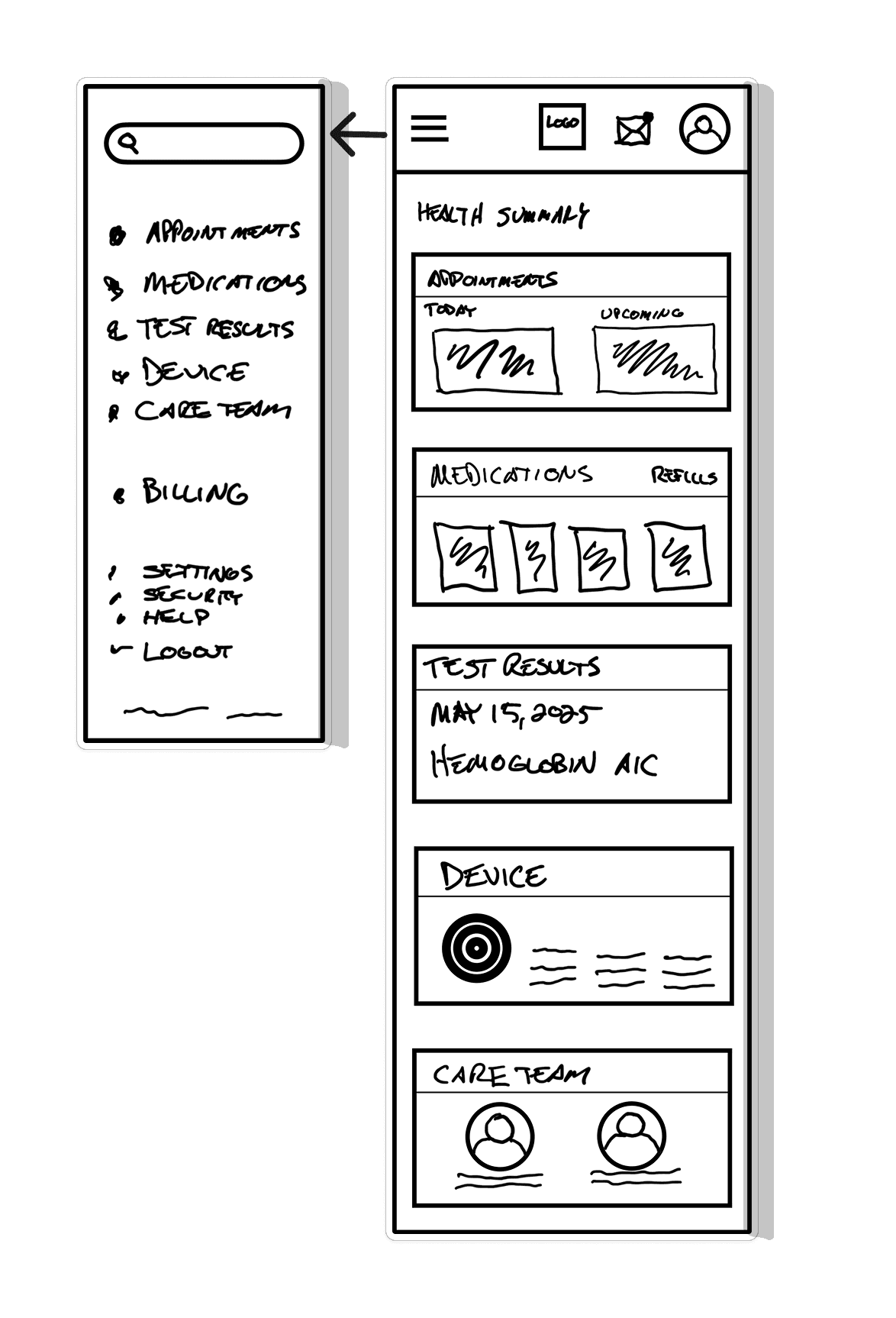
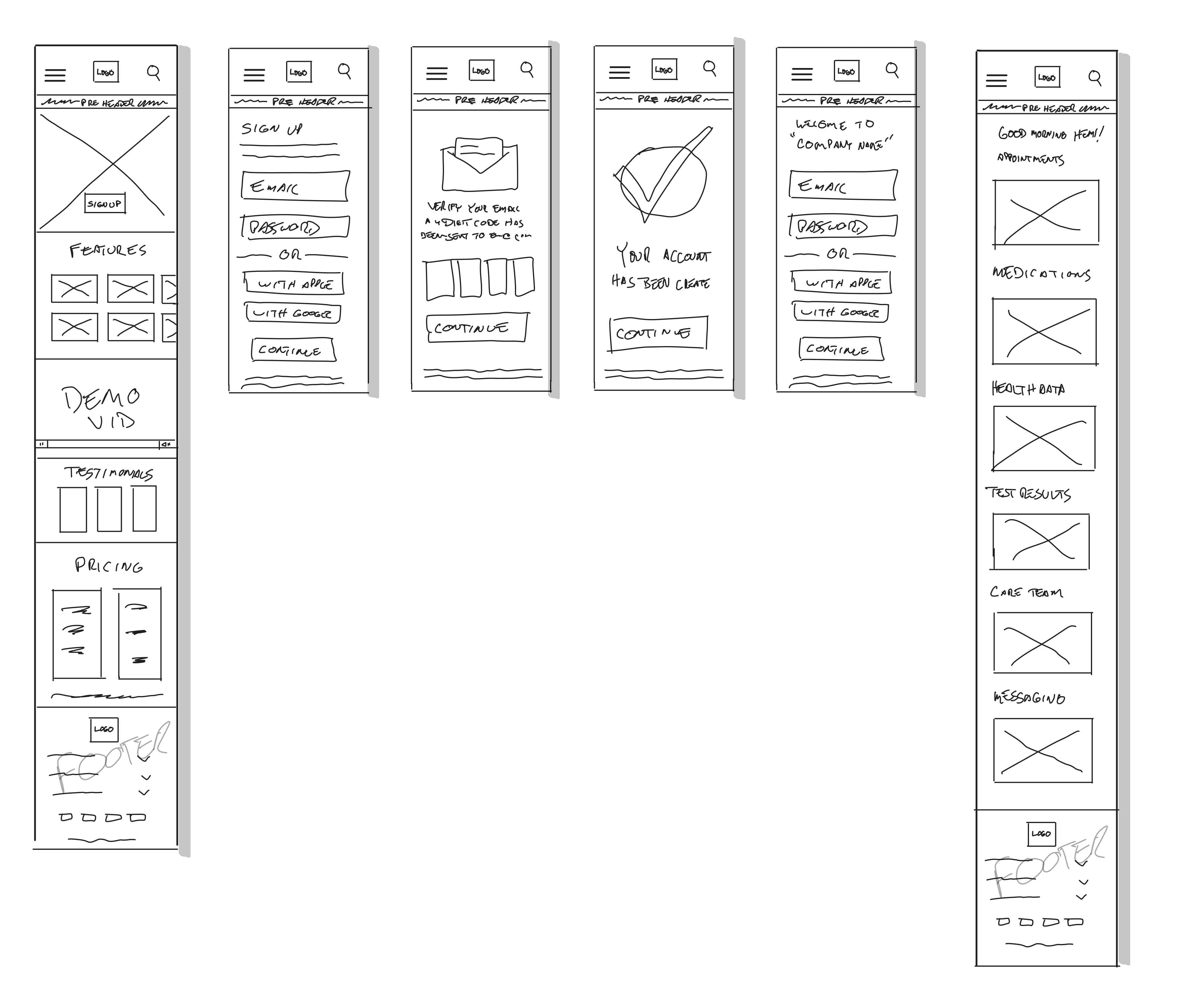
I began sketching out my ideas for the dashboard and the user flows. I created paths for the user, but no entry or end point, yet. I grabbed my iPad and began to sketch what I visualized this movement to be.
There were many iterations, (and erasing) but the challenge of the dashboard started to take shape.
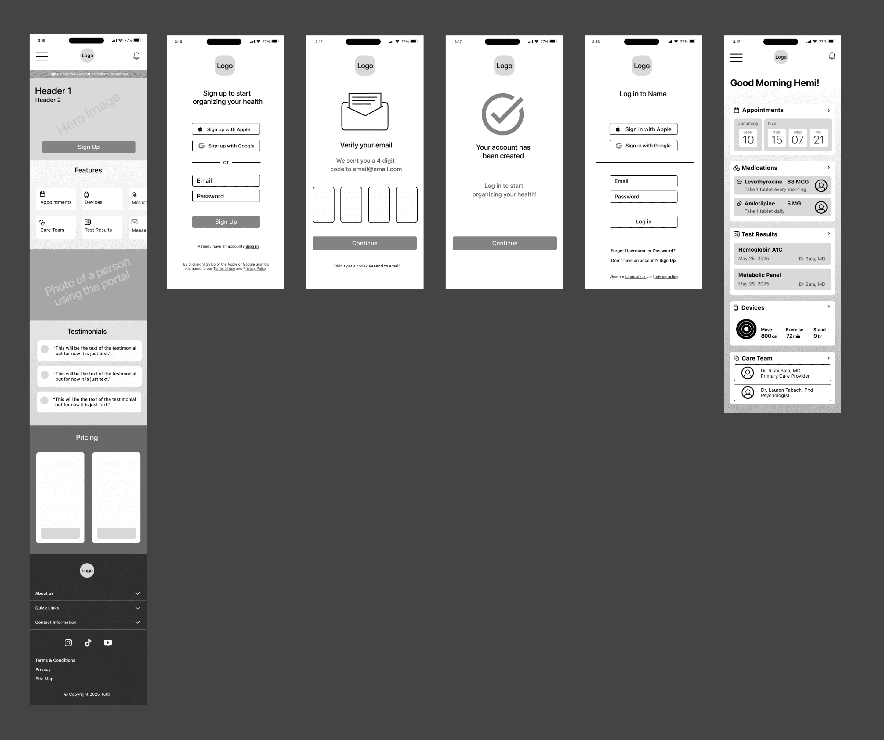
Going Beyond a Sketch
The next step in bringing this to life was building it as a mid-fidelity wireframe. This is where I was able to refine the content and begin to see how this could actually work, but not without obstacles. Almost there.
Discovering Alle
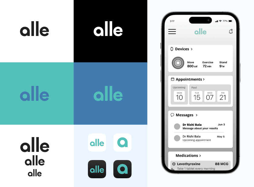
The site needed a name and a soul. The word alle is derived from the Norwegian language meaning everybody and everyone, which seemed fitting. I liked the composition of the word and choose a logotype over a brand mark.
The color palette for alle was found after doing research of palettes used in the medical field and understanding color psychology in health care. Thanks to an article from the National Library of Medicine, which is available here.
Testing
Prototype and Testing
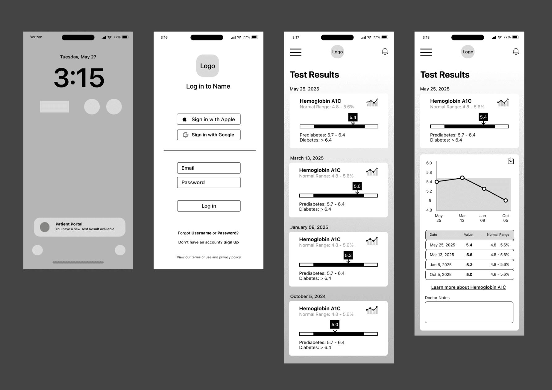
The prototype focused on 2 flows: 1-Signing Up 2-Viewing a Test Result from a Notification.
I also asked the participants to navigate through the dashboard and other areas to see how the overall site flowed.
Results
The results of the testing were positive. Each task had a 100% success rate with the first task taking an average of 40 seconds to complete and the second task taking an average of 6 seconds to complete.
Positive feedback
Branding design
Fonts and sizing legible
Color palette was calming
Dashboard and side panel navigation
Priority revisions
CTA verbiage
Add language selection
Add to Care Team option
Side panel navigation order
The Product
I met my research goal which helped me to learn how people without access to resources organize their health care needs.
I enjoyed having open conversations with people who felt strongly about their health. Hearing their stories inspired me and gave me a stronger drive for this project.
Exploring the emotional side of not having resources was a true help in Alle’s creation.
I discovered what tools are currently available and what they offered patients to help make Alle a source of calm when dealing with the stress that comes with health care.
All of these steps came from a place of empathy. I understand the importance of patient portals and how frustrating the process can be without one. So I created an open-access tool to help people stay organized with their healthcare needs.
Brian (Hemi) Himmler
Product Designer
hemi.himmler@gmail.com